

In the process of the research I’ve been doing that I mentioned previously, I’ve had to ponder how to classify things within the NCAA dataset I’m using on a competitive basis. On the face of it, that might seem straightforward. Just use the Division breakdown.
Small problem with that, though. There’s a lot of overlap between the three levels. It’s not the case where you can simply say Division I > Division II > Division III.
On average, sure. That’s a reasonable statement. It’s not enough if you want to do analysis with any degree of nuance, however. So how can we objectively compare competitive levels, in particular when viewing things in terms of conferences?
How teams make their points
I’ve had two ideas. My initial thought was to look at things in terms of “earned” points – kills, aces, and blocks. The higher the competitive level, generally speaking, the fewer points teams earn from opponent errors. Here’s a comparison of what the three women’s NCAA divisions look like in terms of the distribution of earned points per set based on conference averages over the last several years (conference-only matches).
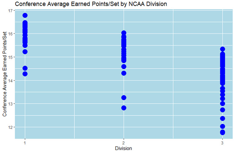
While the general pattern above is about what I expected, I had one concern which stimulated my second idea. That’s the higher prevalence of aces at the lower levels of play. Aces are registered as earned points for the serving team rather than as errors for the receiving team (at least in my data), so the points comparison could be a little be off on that basis. As a result, I thought to just use Kills/Set instead. Here’s what that looks like.
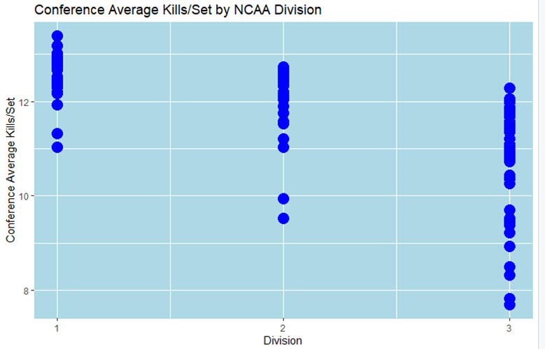
Not a heck of a lot of difference, right?
It’s notable that in all three divisions we can see indications that the top level conferences are a bit out ahead of the rest. At the same time, there’s a fairly tight cluster across most of the conferences, but then at the bottom end the splits become quite apparent.
Checking my findings
As a check on my work I decided to compare these findings to a secondary source. That’s the Pablo Ranking published on Rich Kern’s website. There’s a page where the rankings for all three NCAA divisions, plus NAIA are all together (subscription required). It’s on a team rather than conference basis, but it still gives us a sense of how the division compare.
Here’s what they look like based on the conclusion of the 2019 women’s college season.
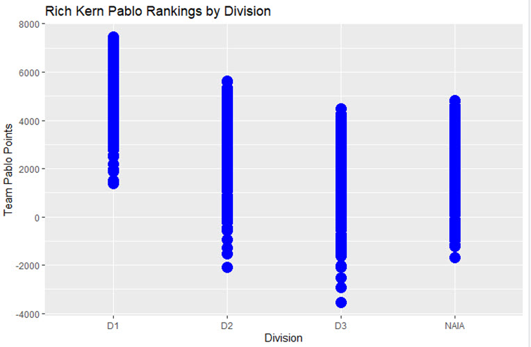
Pretty close to what I came up with, I’d say.
Conclusions
This analysis confirms what I said at the top about there being quite a bit of overlap between the NCAA divisions. It also makes quite clear that prospective college players and their parents – as well as their juniors club personnel and/or high school coaches – should have a very different perspective on college volleyball than simply Division I > Division II > Division III.
Anyway, now that I’ve demonstrated that I can’t simply use a Division split for my research, I need to come up with another way. That might be to simply split things up by the Kills/Set averages.
Plenty more still to come on this research!

5 Responses
Box and whisker plots would make this a lot more readable and interpatable
I actually wanted to do overlapping semi-transparent density curves, but my skills with R – which I use to do my analysis – are not yet to that level. 🙁
Any chance you have the first two charts including NAIA data?
I would need the NAIA data, which I don’t have at present.
For D1 can you name the conferences in order? I’m assuming big 10 is at the top.